do.it
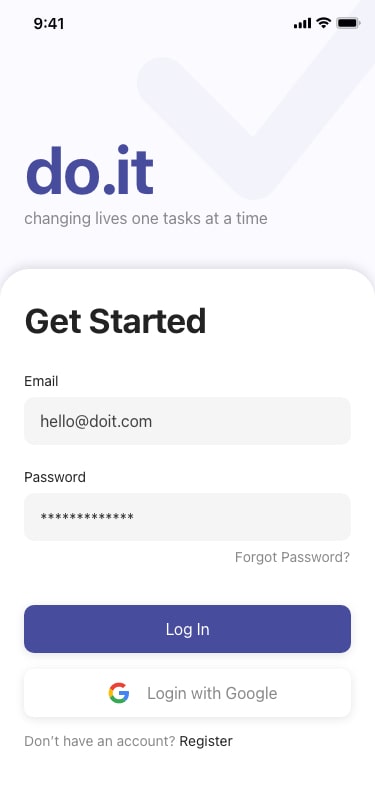
do.it is a productivity tool designed to help individuals efficiently manage and complete more tasks.
Problem
It is estimated that 3 in 4 people in the US keep some form of a list. However, statistics show that 41% of to-do items are never completed and forgotten.
Responsibilities
Conducting user interviews, paper and digital wireframing, low and high-fidelity prototyping, conducting usability studies, accounting for accessibility, and iterating on designs.
Team
Ongoing project working with an engineer to build the MVP. As we are working 100% remotely, we use Zoom and Kakao Talk to communicate. Designer-developer handoff is done through Adobe XD. Prototypes with animations were created to clearly communicate how different components interact to prevent potential misunderstandings.
Don’t like reading? Skip to designs
Category
iOS Application
Duration
Ongoing
Tools
Adobe XD
Figjam
User Interview
Empathy Map
Persona
Problem Statement
How Might We’s
Crazy Eights
Wireframe
Prioritization Matrix
Mockups
Low-fi Prototype
High-fi Prototype
Usability Testing
Design Iteration
Affinity Diagram
Empathize
Conduct User Interviews
To get a bit of context into the existing problems with to-do lists and to get a better understanding of the users, I started by conducting 3 user interviews. I set clear interview goals and prepared 3 open-ended questions that guided the initial direction of the research.
Interview Goals
- Understand common challenges busy individuals face when organizing tasks using a to-do list.
- Identify what is keeping individuals from efficiently using to-do lists.
- Find potential points of friction users face when using to-do list tools.
Interview Questions
- What is your experience with managing tasks with to-do lists?
- Is there any way in which you feel you can improve your productivity?
- Which to-do list or other productivity tools have you used?
Target Participants
- People that use to-do lists
- Employed
- Ages 20-65
- Participants of different genders
Synthesize Interview Data
Interview Transcription
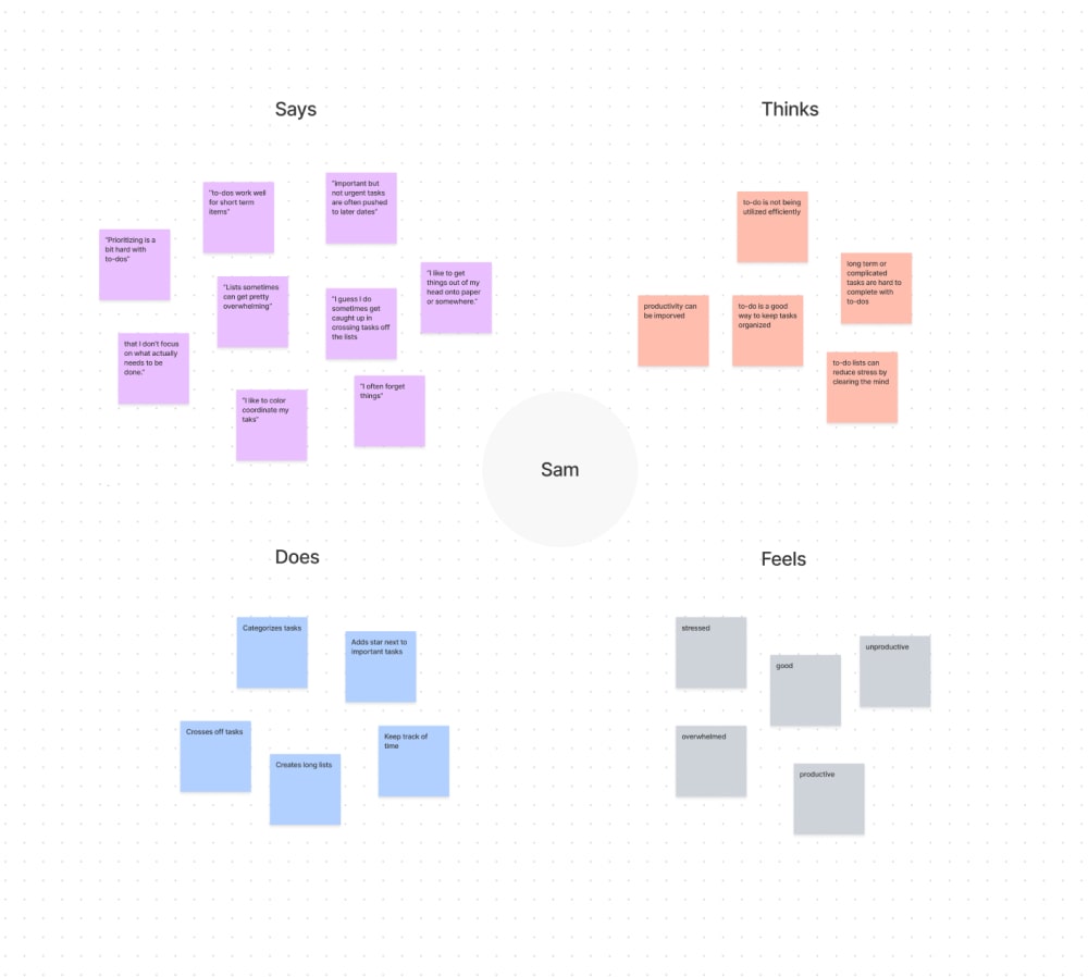
After conducting the interviews, I transcribed all the interviews and created empathy maps of each participant.
View full interview transcript: View
Aggregated Empathy Map
I looked for common themes within the empathy maps and drew an aggregated empathy map of all the participants.
Pain Points
Based on the aggregated empathy map, I was able to come up with 3 main user pain points:
- Task Prioritization: People have a hard time prioritizing tasks, resulting in simple tasks getting completed over important ones.
- Long Lists: Adding tasks to a to-do list is easy. Lists quickly grow and people are overwhelmed.
- Uncompleted Tasks: A large number of tasks on to-do lists are never completed, especially if they are long-term tasks.
Define
Define The Problem
Problem Statement
Completeing the research stage, I was able to take everything that I learned about the user and define a problem statement.
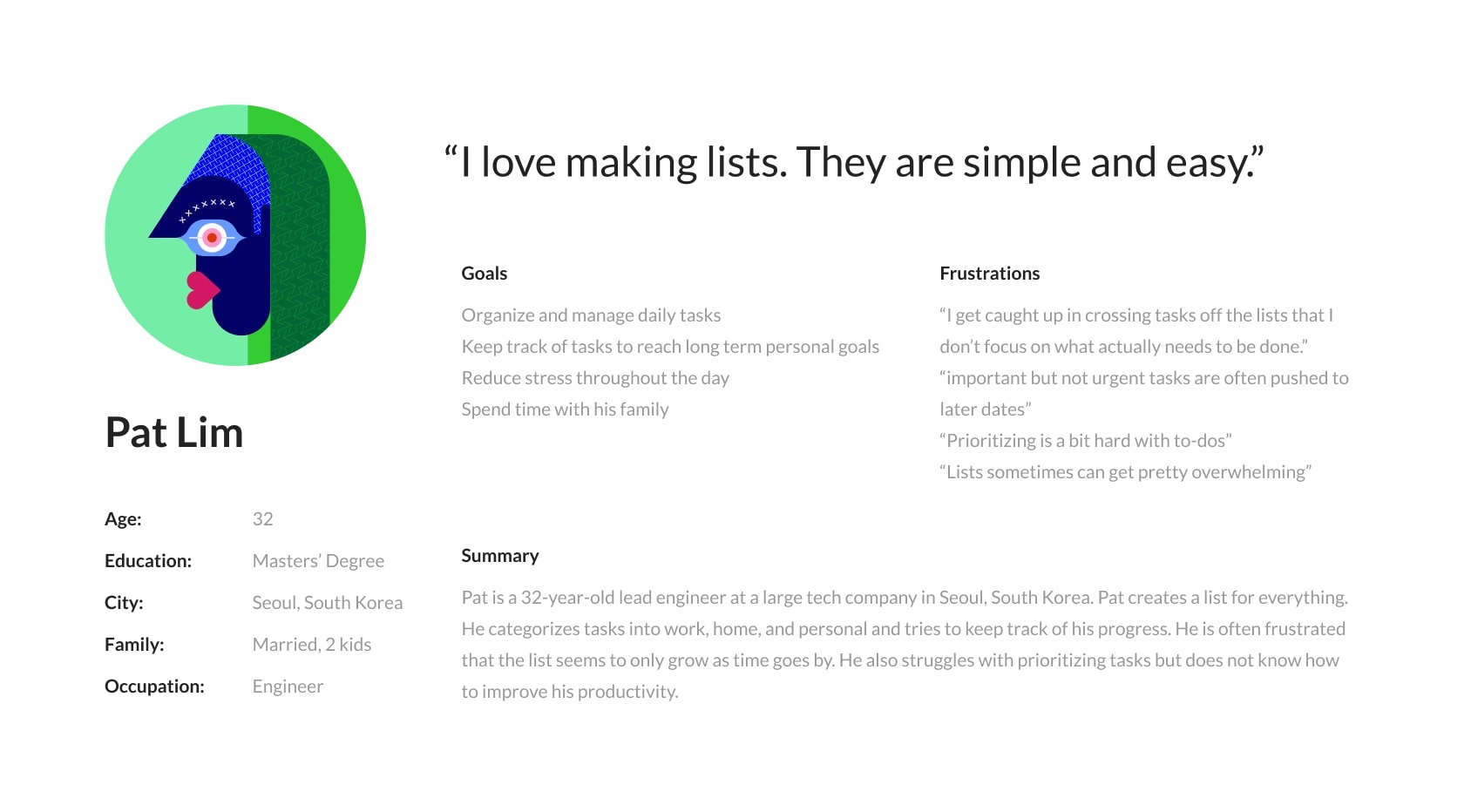
Pat is a busy professional who needs a better way to prioritize and manage tasks because a lot of tasks on the to-do list are not gettings completed.
Ideate
Explore Solutions
How Might We's
I began my ideation by preparing a 4 how might we questions to get ideas flowing.
- How might we decrease the number of to-do list items so users are not overwhelmed?
- How might we make the to-do list more fun so people can complete more tasks?
- How might we increase the completion of to-do list tasks?
- How might we help users prioritize tasks so more important tasks are getting completed?
Crazy Eights
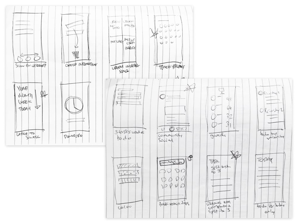
With a large list of possible ideas from the how might we exercise, I continued to explore solutions by completing several Crazy Eights exercises.
Potential Solutions
Some of the solutions were:
- Group tasks with 4 tags based on importance and urgency: important and urgent, important but not urgent, not important but urgent, not important and not urgent. Help users prioritize.
- Track progress to encourage task completion.
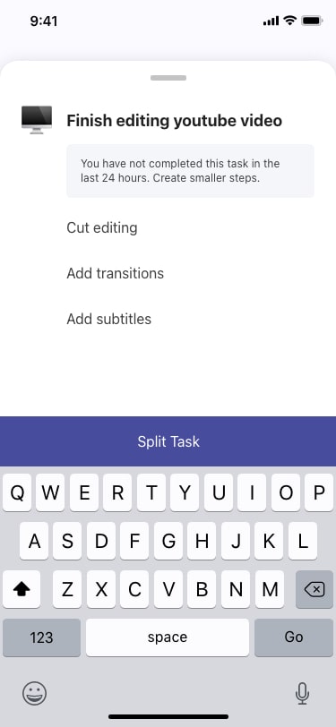
- Split tasks to 3 smaller tasks after 1 full day of not being completed.
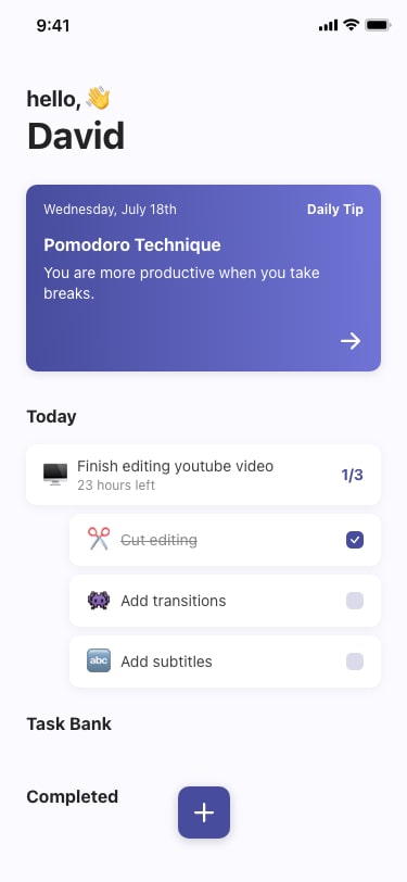
- Add 24 hour countdown to encourage task completion.
- Organize tasks by year, month, week, day. Increase task completion by breaking down tasks.
- Create a community with a ranking board for productivity: gamify productivity to increase task completion.
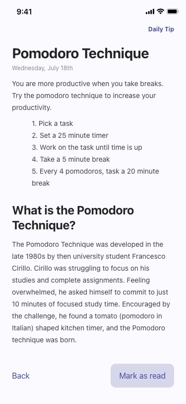
- Add daily productivity tips/ send notifications to encourage users to open app.
- Allow users to only set 3 tasks for “Today” list. Helps users prioritize.
Prioritization Matrix
With a list of possible design solutions from the previous ideation exercises, I organized the features on a prioritization matrix to narrow down solutions based on impact and effort. This gave me a clearer understanding of which features would bring the most value to the user and which features I wanted to work on implementing first.
Solutions to Pursue
Based on the prioritization matrix, I decided to pursue 3 main features that would address the pain points found in the research: task prioritization, long lists, uncompleted tasks.
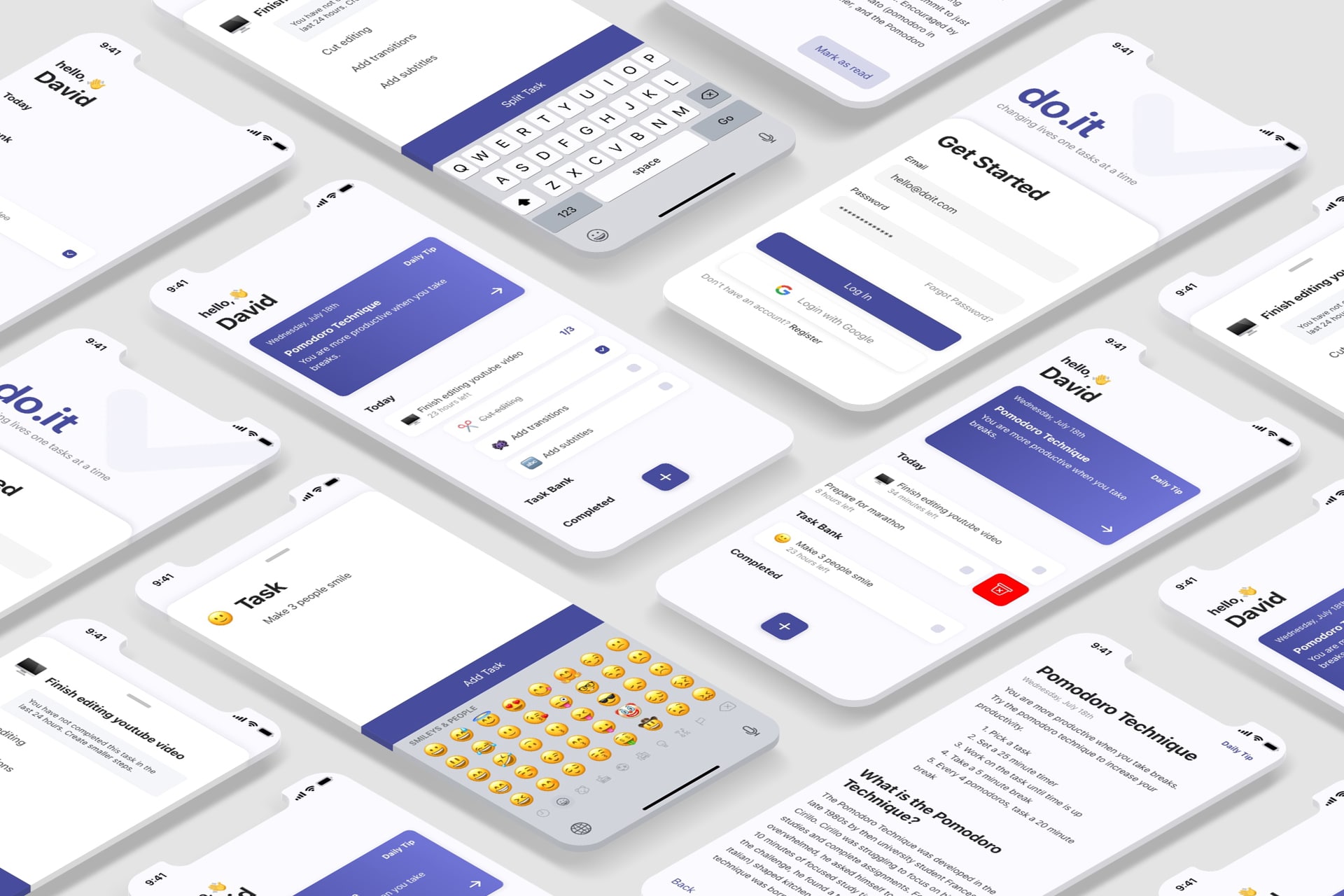
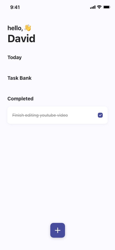
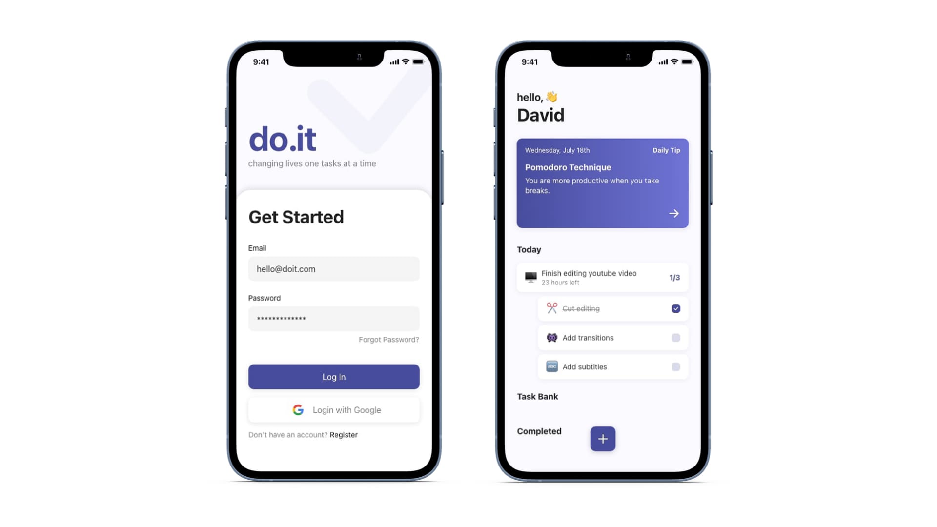
Task split: If the tasks are not completed within 1 day, the user is asked to split the task into 3 smaller tasks(ex. finish editing youtube video -> cut editing, add transitions, add subtitles). This helps increase task completion as smaller tasks are easier to complete.
24-hour countdown: The countdown acts as visual feedback to encourage users to complete tasks by adding a sense of urgency.
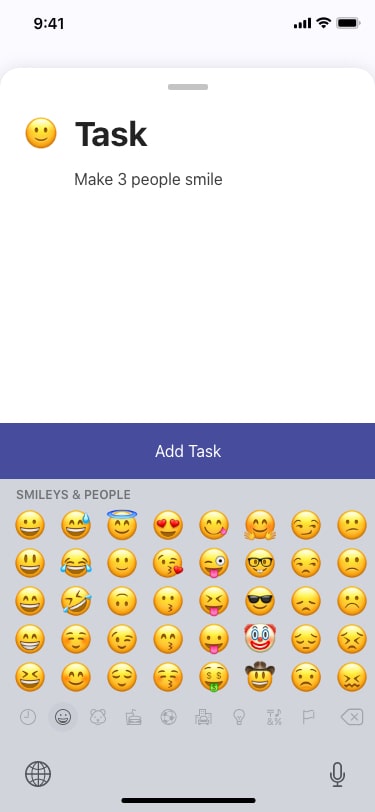
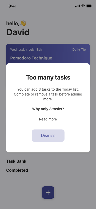
3 Daily Tasks: Users are encouraged to pick 3 tasks a day. If a user adds more than 3 tasks to the “Today” list, they receive a popup with an explanation of why they can only add 3 tasks. This is so that users can focus on important tasks. This encourages prioritization and keeps lists short.
Convert Solutions To Wireframes
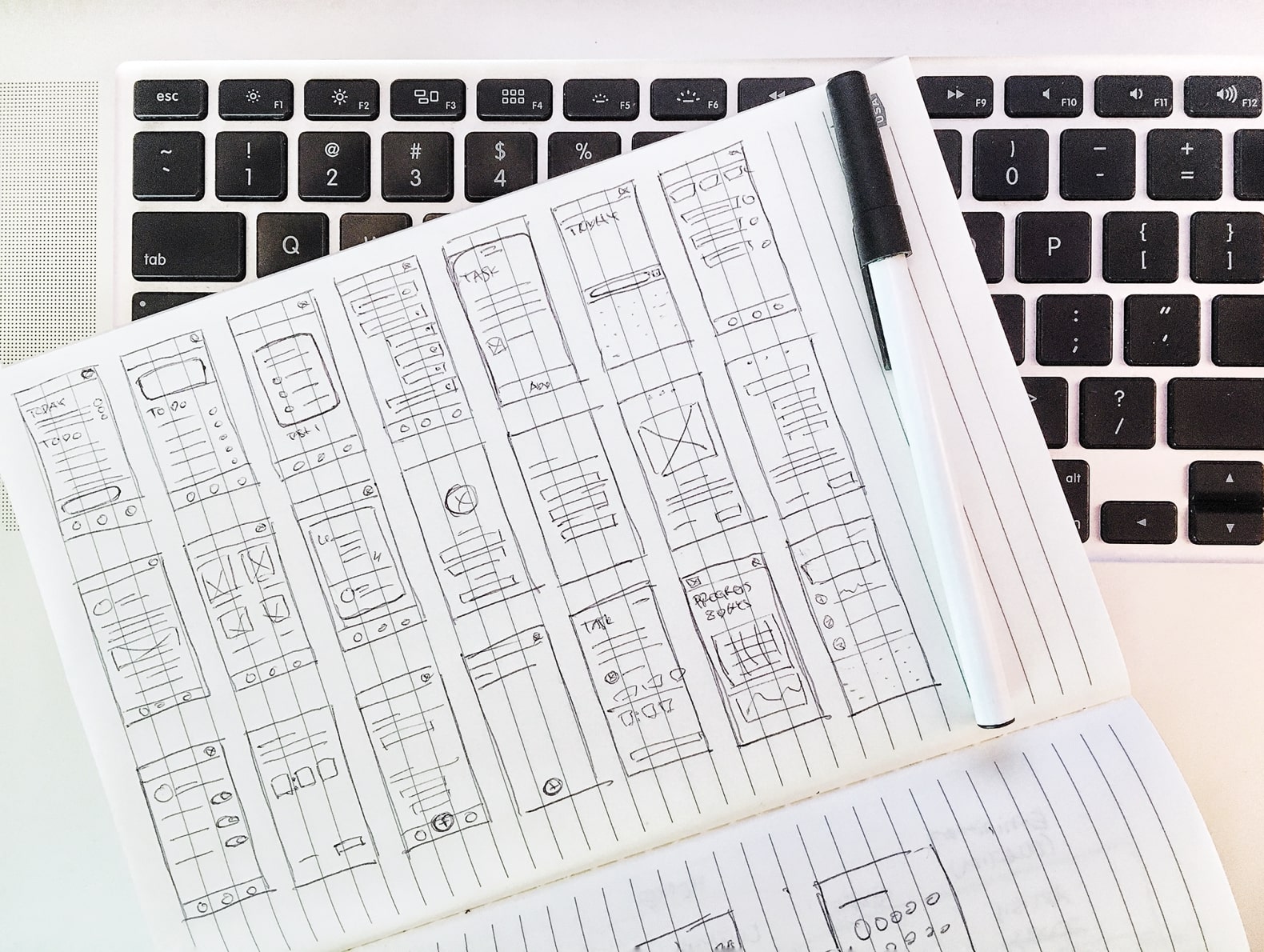
Paper Wireframe
Focusing on the previous solutions and features that were in the high-impact, low-effort quadrant, I began sketching multiple variations of each screen. I sketched 3-4 variations for complicated screens(home, split task, etc.) and 1-2 variations for simple screens(sign up, settings, etc.).
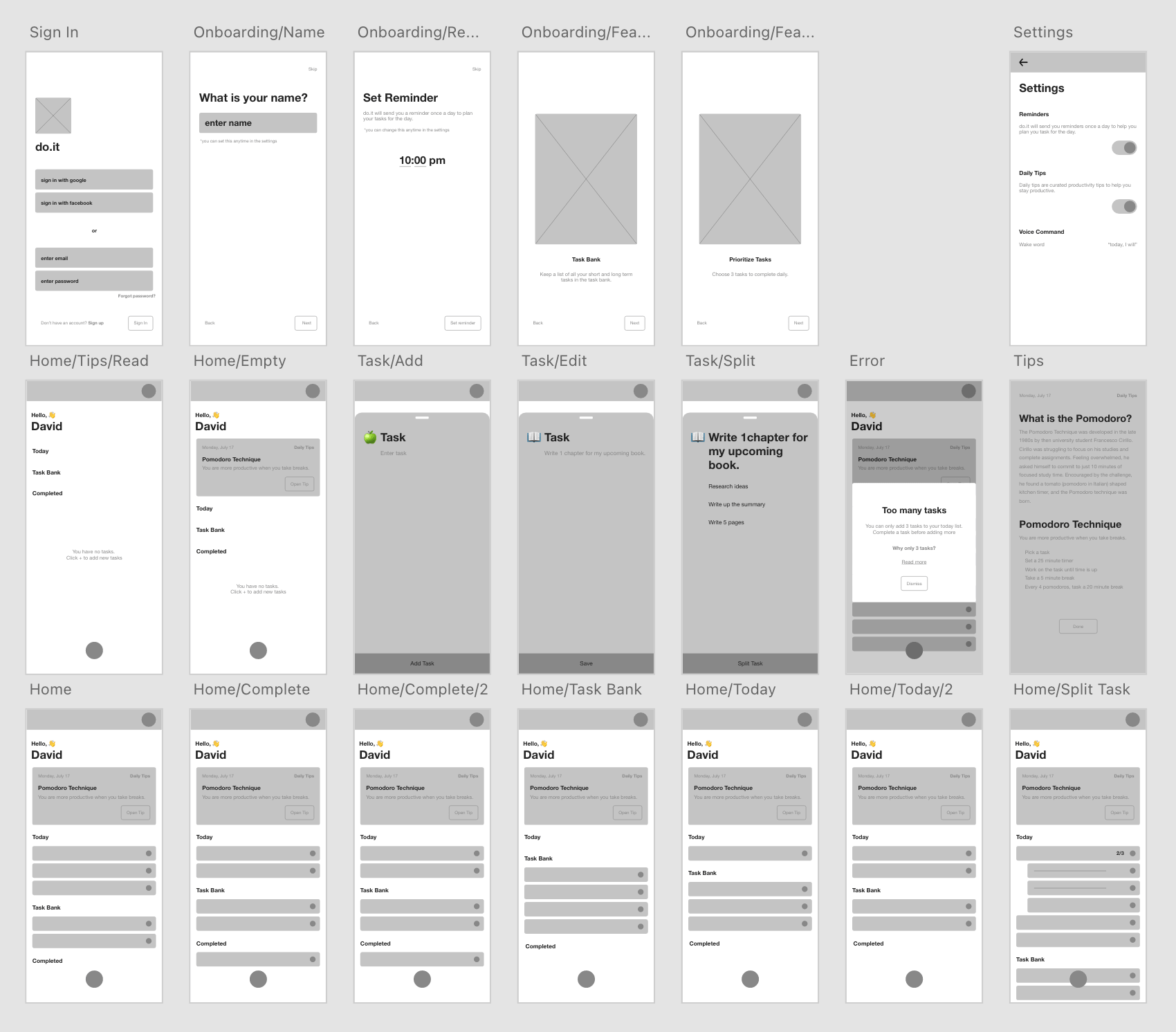
Digital Wireframes
Thinking back to the user pain points and their goals, I sorted through the wireframes to mark layouts/features that best accommodate the users’ needs. I then combined everything I marked to create each page of the digital wireframe.
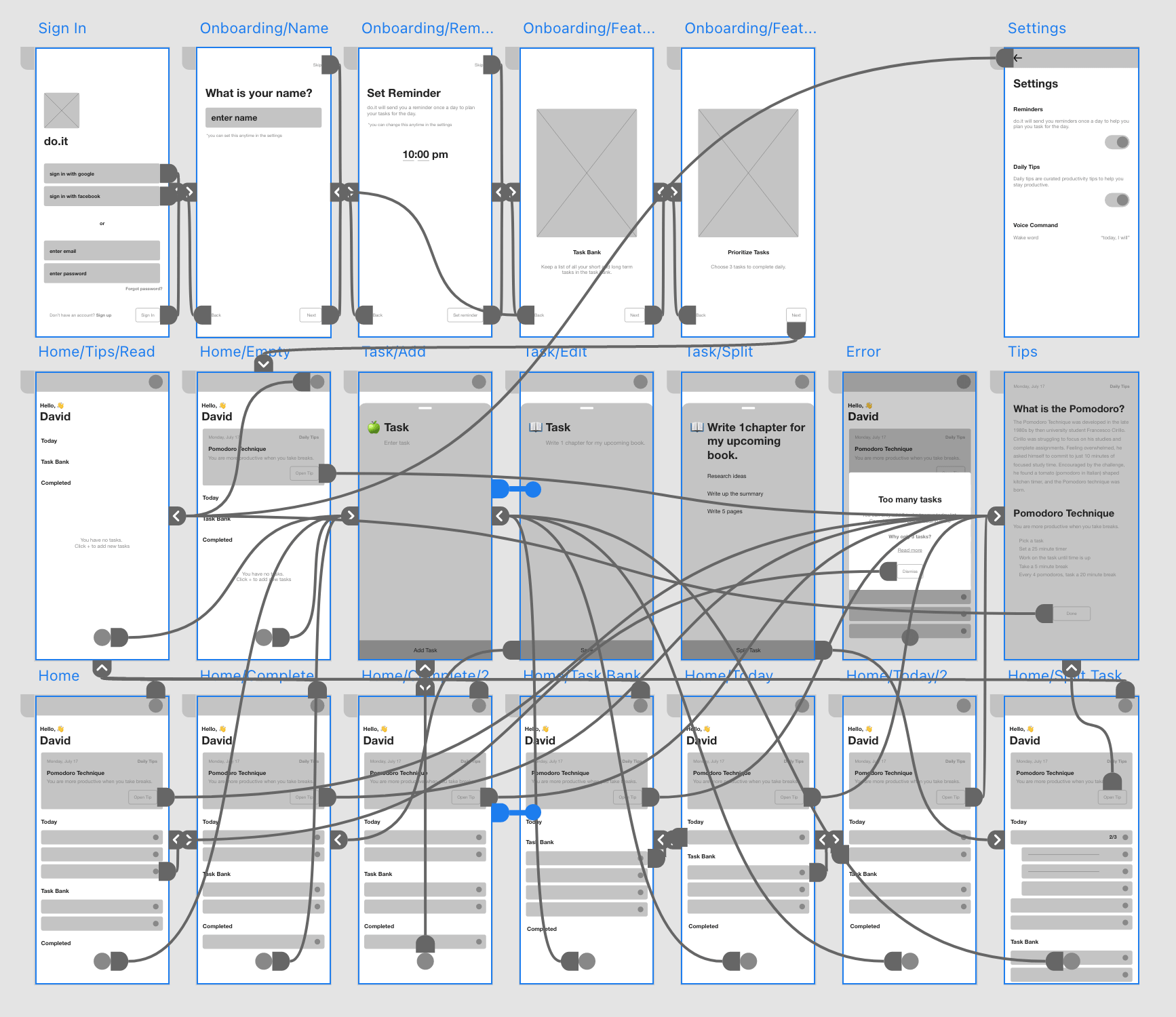
Prototype
Test
Conduct Usability Study
Before conducting the usability study, I laid out all the important parts of the study to make sure I had a clear goal.
Research Goal
Figure out what specific difficulties users encounter when they try to complete the core tasks of the do.it app. Collect qualitative and quantitative data and determine participant’s overall satisfaction with the product.
Research Questions
- What can we learn from the current user journey that we can improve on?
- Are there any parts of the process users are getting stuck?
Methodology
Type: Unmoderated usability study. Talk aloud.
Location: Seoul, Korea, remote.
- 5 participants will complete predetermined tasks and fill out a questionnaire on their experience.
- Each session will last 30 minutes and will include an introduction, a list of tasks, and a short questionnaire.
- Participants will be asked to record the screen and think aloud.
Participants
- People that use some form of to-do lists on a regular basis.
- Age group from the following ranges: 20-30, 31-50, 50+
Script
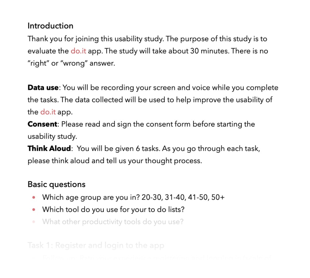
I wrote up a script to guide the usability study to make sure each participant had all the necessary information about the study. The script included an introduction, a section on data use and consent, instructions on think aloud method, basic questions, tasks and a survey.
View full script: View
Iterate Design
Iteration
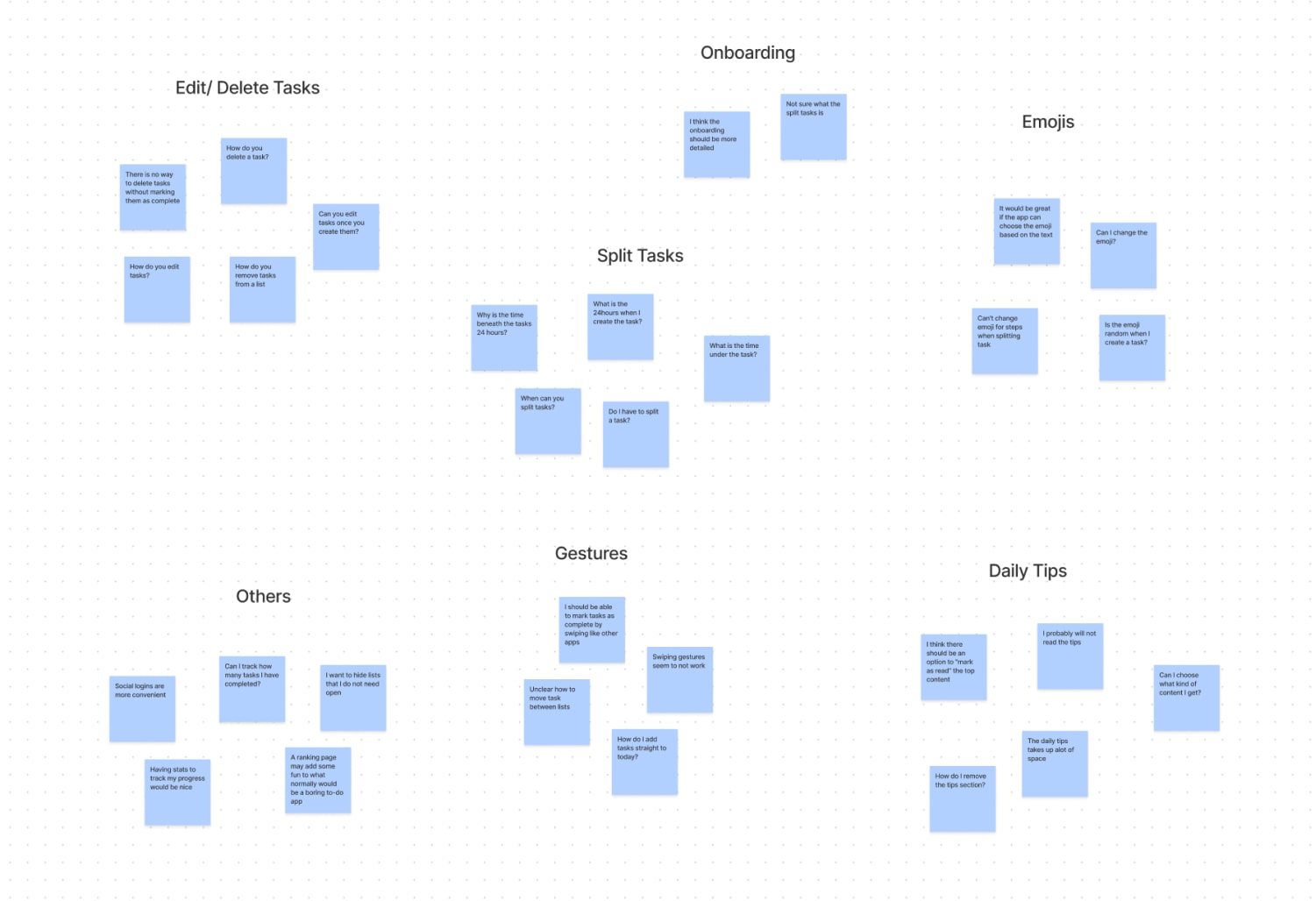
I focused on recurring themes from the affinity diagram to organize findings into insights to implement into the design iterations.
Iterate
Delete Tasks
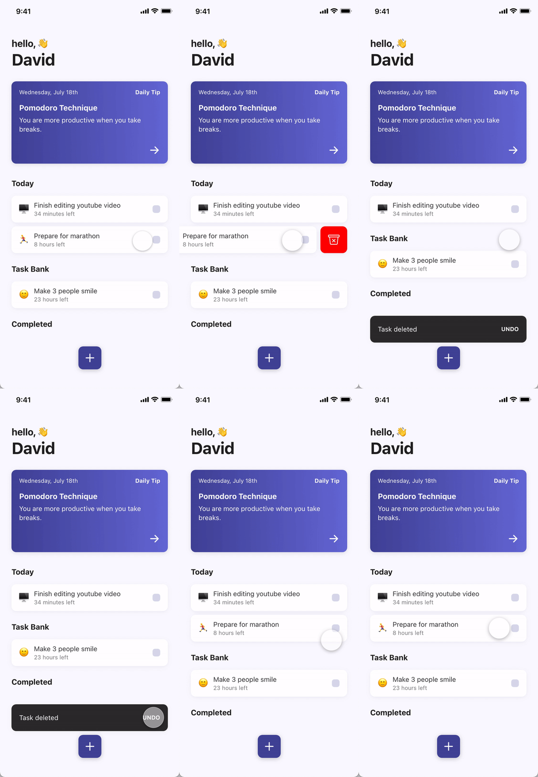
Swipe To Delete
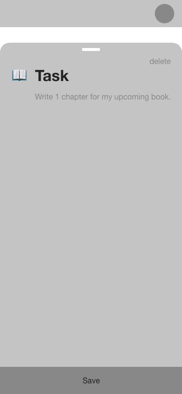
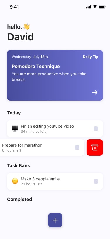
During the usability test, there was feedback that users wanted an easier way to delete tasks after task creation without having to click on each task and deleting it from the edit page.
Solution: delete feature was added to the main to-do lists for quick task deletion.
Daily Tips
Mark As Read
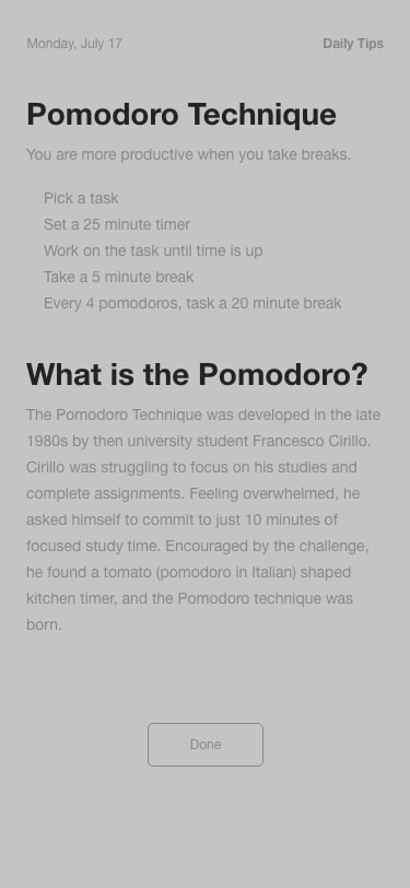
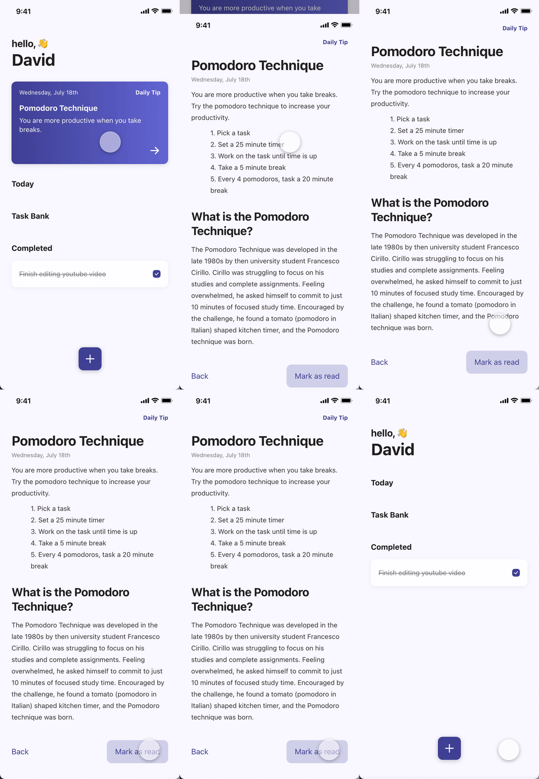
In the early designs, the daily productivity tips stayed fixed on the top of the screen. After the usability study, it was clear that some users thought that it was taking up too much space and not all users wanted daily tips.
Solution: “Mark as read” button was added so that users can remove daily tip once read.
Gestures
Choose Your Method
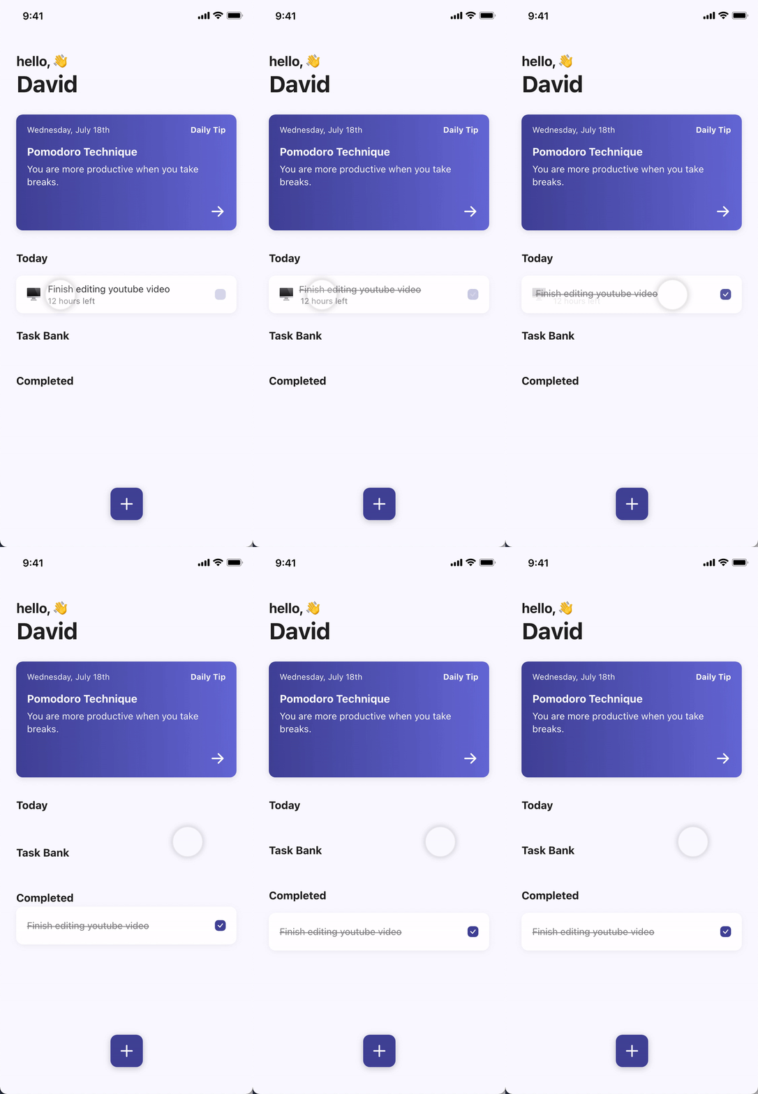
In the low-fi prototype, users could only complete tasks by clicking on the checkbox. Conducting the usability study, I noticed users trying to drag tasks to move them into the completed list.
Solution: Add industry-standard gestures users are familiar with. Users can complete tasks in 3 ways: holding and dragging, tapping the checkbox, swiping right.
Accessibility
Consider Accessibility
WCAG
Colors that comply with WCAG standards.
Voice Over
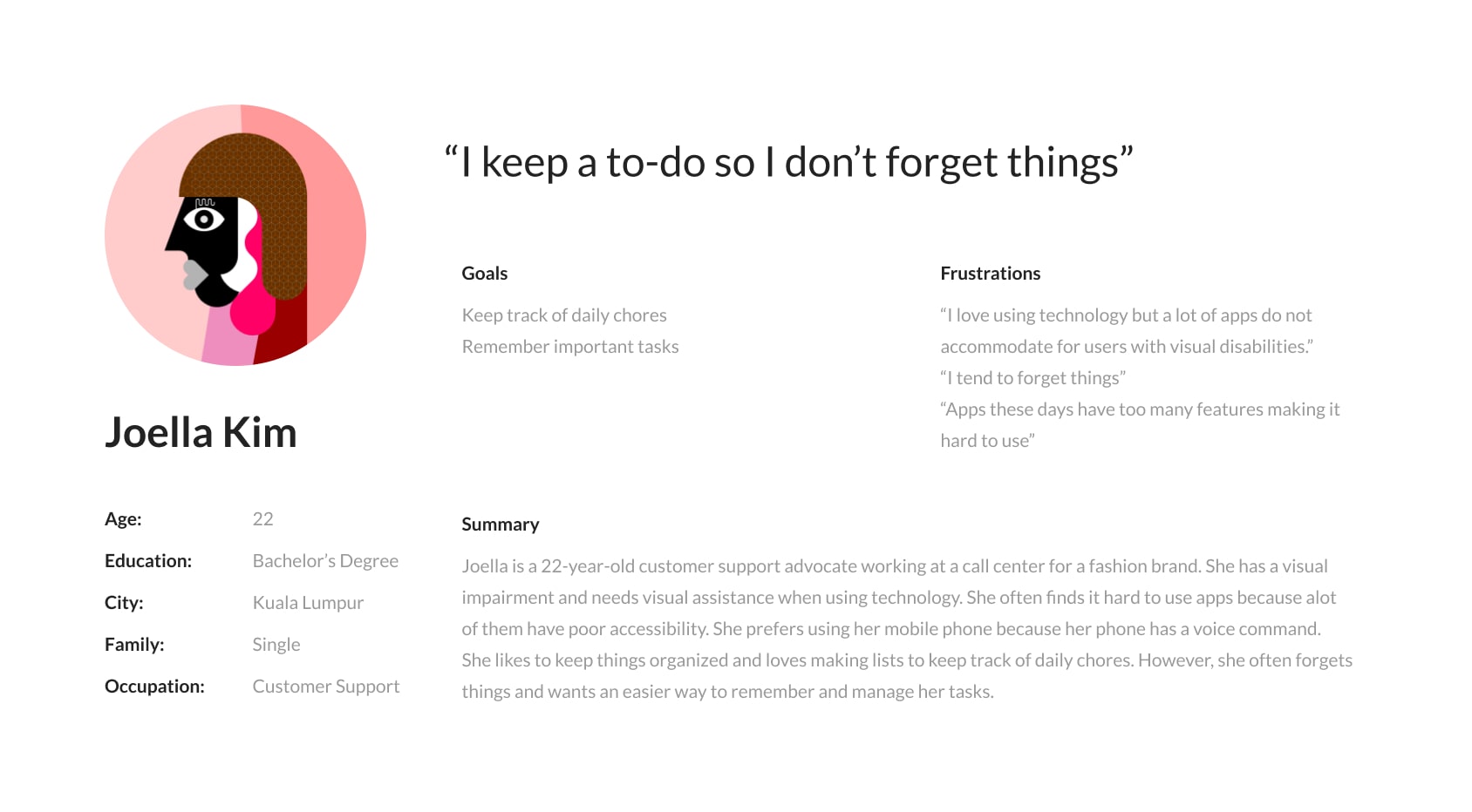
Make sure all elements including images have accessibility labels. Set accessibility trait properties including accessibility hints for components.
Voice Command
Voice command option for primary functions so users with visual disabilities can use the do.it app through native voice commands. A list of all native commands is available in the settings.
Takeaways
Looking Back
Prioritization
When creating a new product, sometimes we get carried away with our vision of the product that we end up trying to add all kinds of features. As resources are limited, it was important for me to always prioritize to decide which features I will build first. This doesn’t mean we need to throw away all the other ideas. We can keep it in an “idea bank” and come back to it later as the product progresses.
Trial Usability Study
During the project, most of the usability studies were conducted remotely unmoderated. Although I did my best to clearly communicate instructions and give the participants all the information that I thought they needed, some participants found it hard to follow through all the instructions. This was especially true because I was testing multiple user flows within one usability study. Running a trial usability study before sending it out to everyone would have solved this issue.
Going Forward
Validate Design Solutions
Conduct another round of usability studies with the high fidelity prototype to validate whether the pain points users experienced before the design iterations have effectively been addressed.
Test Accessibility
Conduct usability studies with participants who have accessibility needs to improve accessibility and equity of the do.it app
Let's Connect
I am always looking for new opportunities to find user problems and design data-driven solutions. Do you have a project in mind?
