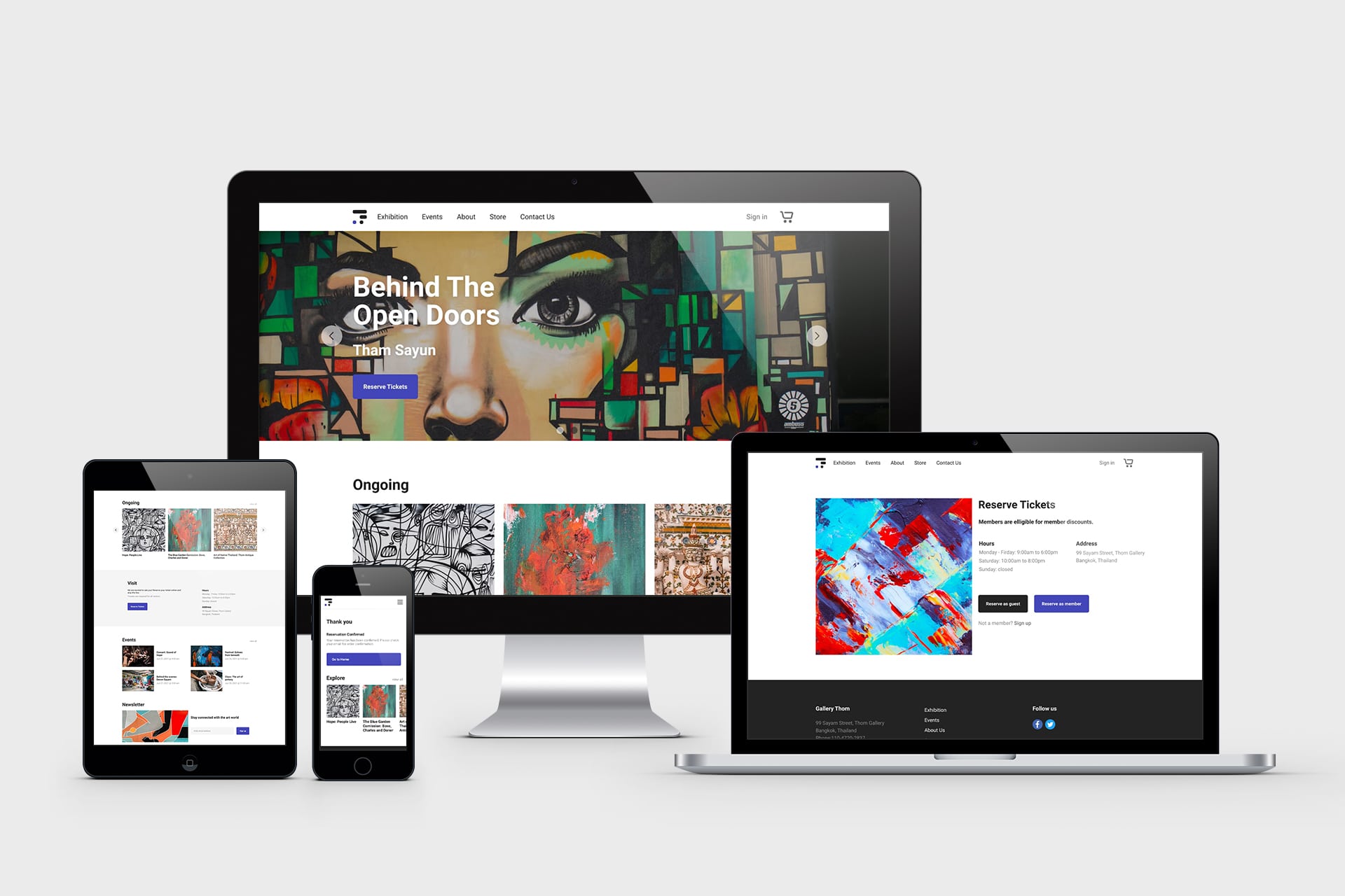
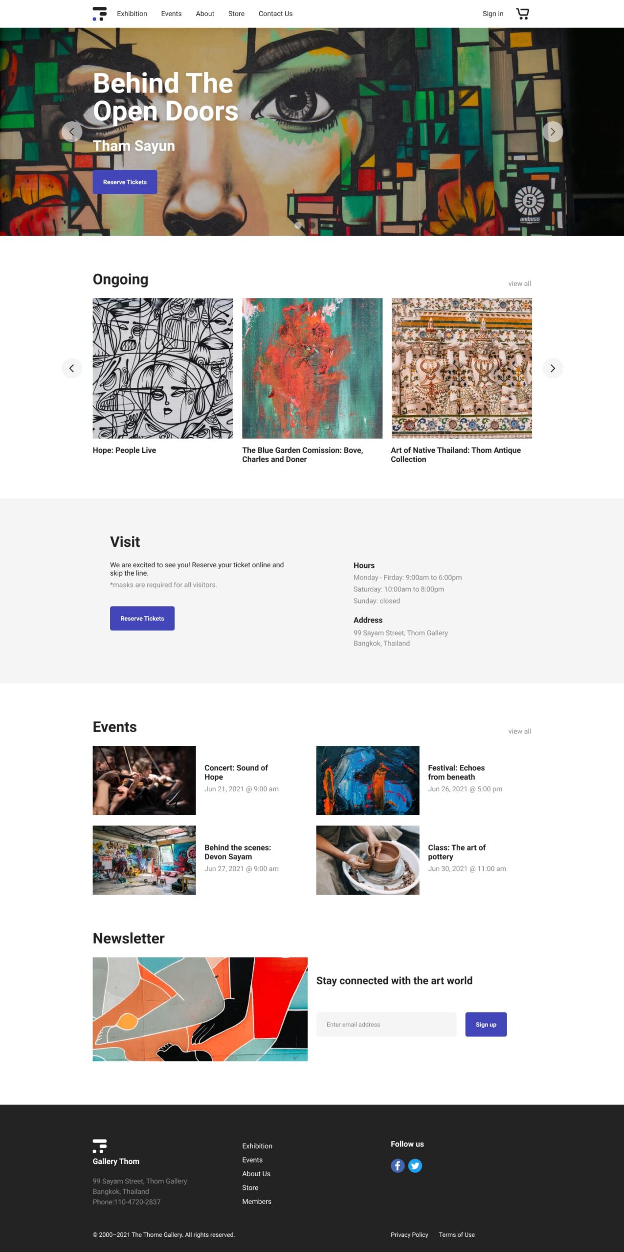
Gallery Thom is an art gallery in Bangkok, Thailand. The gallery hosts new exhibitions regularly and also plans events for the community. They currently do not have a website and are planning on launching a new gallery website. The new site will allow reservations for exhibitions and events held by the gallery.
Target Users: Busy professionals who enjoy art and want to get notified of new exhibitions and gallery events.
Responsibilities
Conducting user interviews, paper and digital wireframing, low and high-fidelity prototyping, conducting usability studies, accounting for accessibility, and iterating on designs.
To get a bit of context into the existing problems with to-do lists and to get a better understanding of the users, I started by conducting 3 user interviews. I set clear interview goals and prepared 3 open-ended questions that guided the initial direction of the research.
Interview Goals
Understand current user journey without a gallery website.
Identify what is keeping individuals from learning about new exhibitions.
Find potential points of friction users face when trying to reserve a ticket.
Interview Questions
How do you learn about new exhibitions at art galleries?
What is your experience with the ticket reservation process?
Do you feel there are any ways the art gallery experience can be improved?
Target Participants
People that go to art galleries at least 1 time a month
Participants of different genders
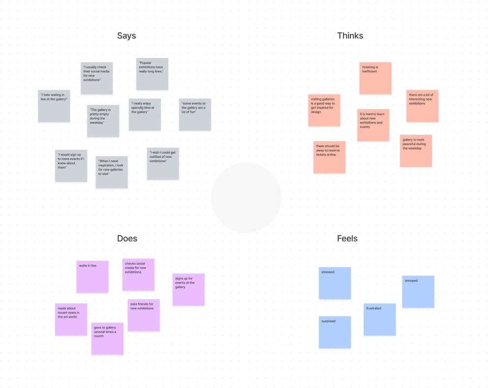
Synthesize Interview Data
Aggregated Empathy Map
I looked for common themes from the user interviews to create an aggregated empathy map of all the participants.
Pain Points
Based on the aggregated empathy map, I was able to come up with 2 main user pain points:
Waiting Times: Art galleries can get very crowded on the weekends. Famous exhibitions often have long wait times as there is a limit to how many people can enter the gallery at one time.
New exhibitions: It is hard to learn about new exhibitions as gallery Thom does not have a website.
Empathize With The Users
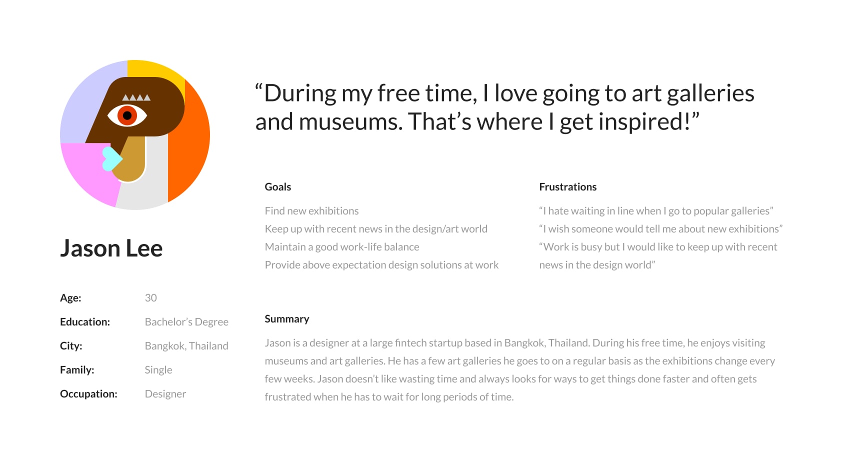
User Personas
Taking data from the preliminary research, empathy maps, and user pain points into consideration, I created user personas.
User Journey Map
I decided to draw a user journey map to further understand the gallery experience from a user’s point of view.
Define
Define The Problem
Problem Statement
Completing the research stage, I was able to take everything that I learned about the user and define a problem statement.
Jason is an art fanatic who wants a quicker way to find new exhibitions and reserve tickets because popular exhibitions can get really busy and have long wait times.
Ideate
Explore Solutions
How Might We's
I began my ideation by preparing 3 how might we questions to get ideas flowing.
How might we reduce the wait times so visitors can spend more time enjoying the exhibition?
How might we increase awareness of new exhibitions and events?
How might we encourage visitors to come back more often?
Competitor Analysis
Exploring other companies and organizations in similar industries is a great way of getting ideas and insight. I examined other gallery websites to see what kind of information they were providing their visitors and also looking for possible points of improvement that I could add to the Thom website.
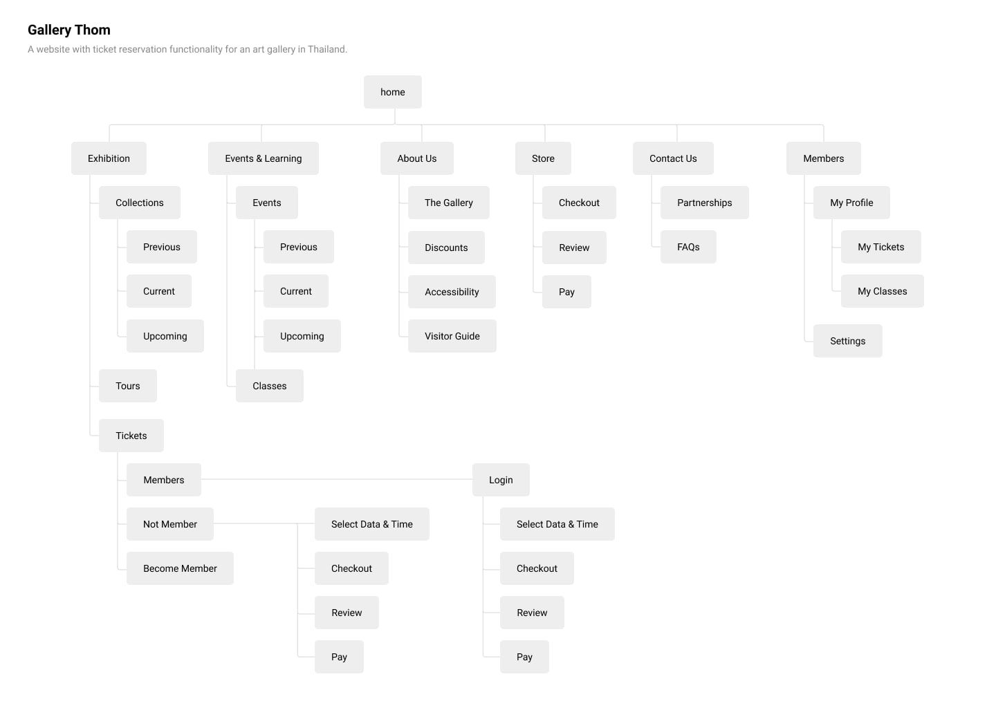
Organize Information Architecture
SiteMap
There are two places I like to look at before creating the sitemap: user journey map and competitor analysis. The user journey map helps me focus on the natural user flow from the user’s perspective and the competitor analysis is a great place to see how others are organizing their information and checking what is and is not working. Taking this into consideration, I mapped out the sitemap for the website.
Convert Solutions To Wireframes
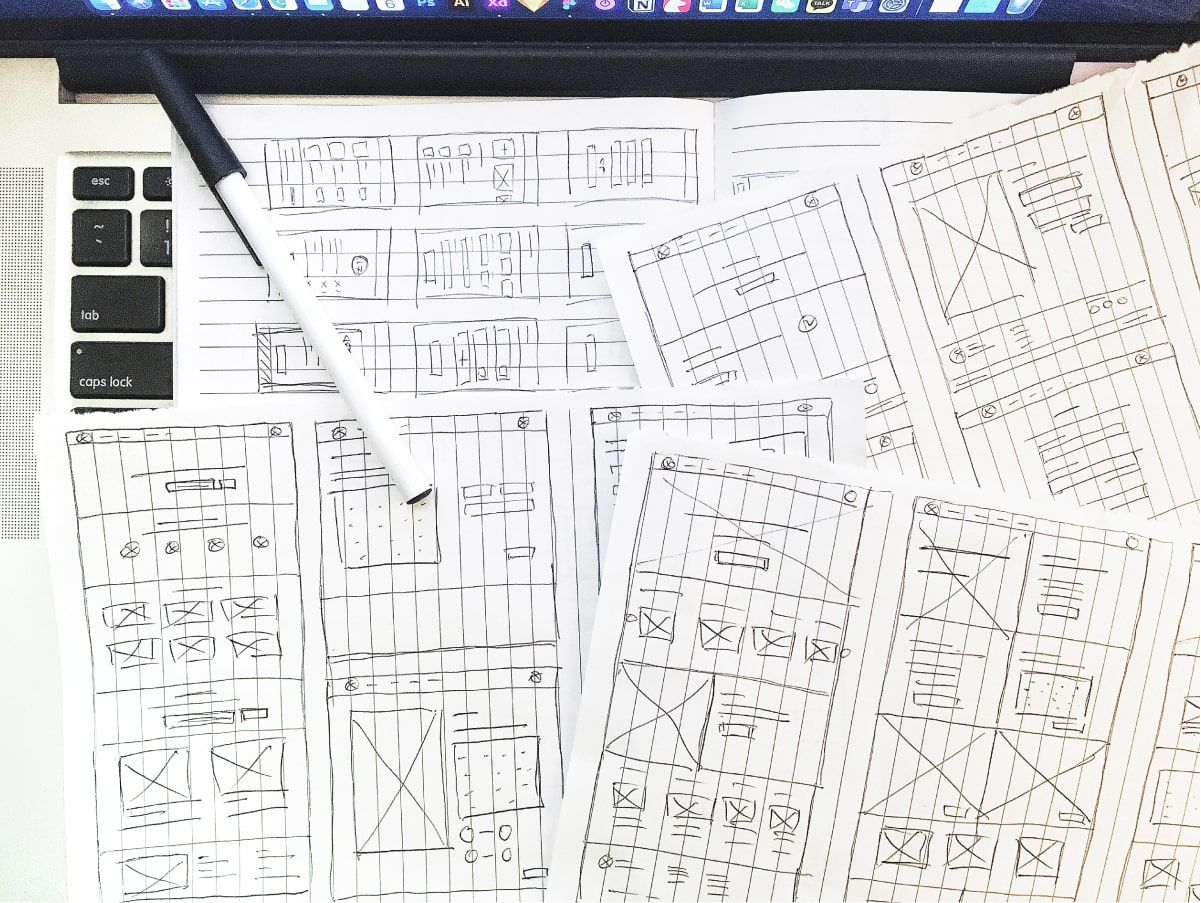
Paper Wireframe
Looking back at the ideas from the how might we exercise and keeping the sitemap in mind, I sketched several variations of each screen.
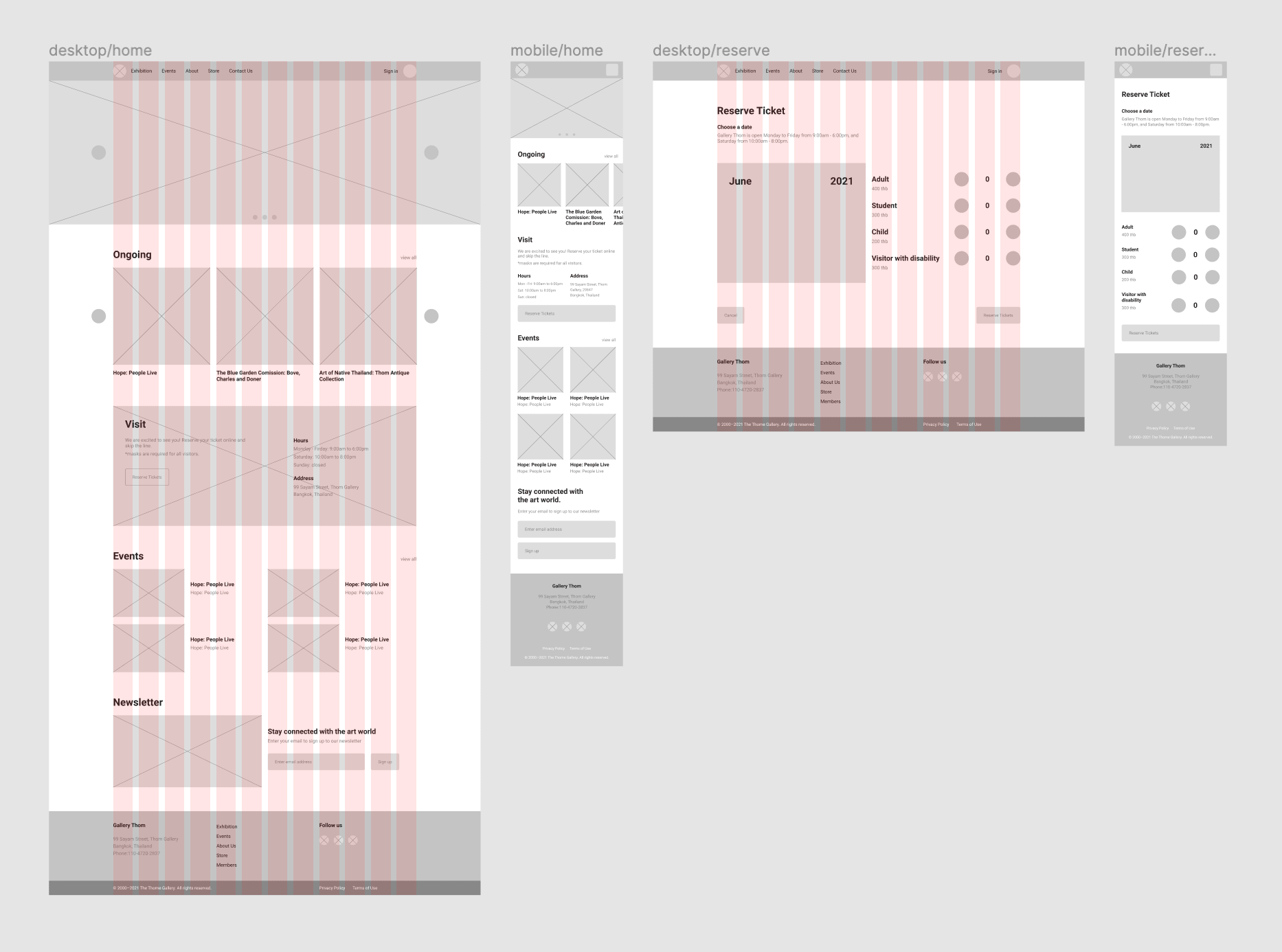
Digital Wireframes
Thinking back to the user pain points and their goals, I sorted through all the paper wireframes to mark features and layouts that best accommodated the users’ needs. I then combined everything I marked to create each page of the digital wireframe.
Prototype
Bring Ideas To Life
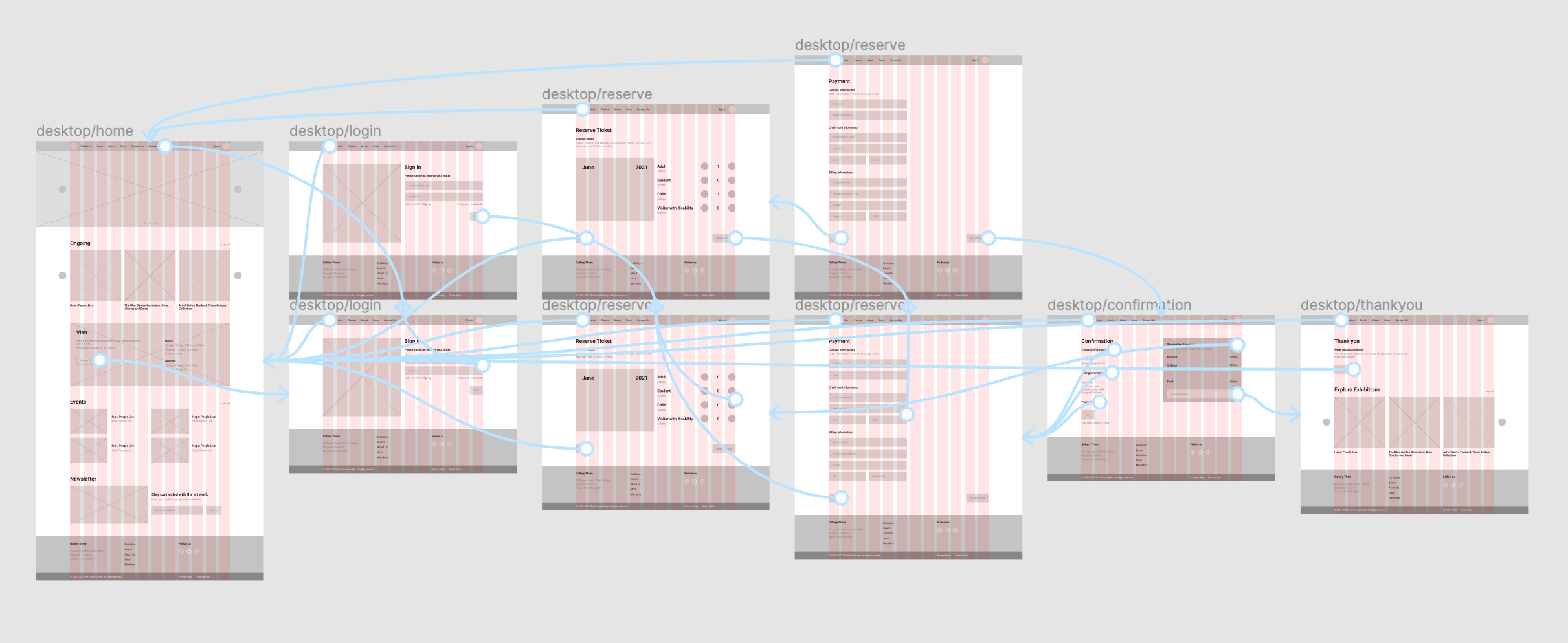
Low-fi Prototype
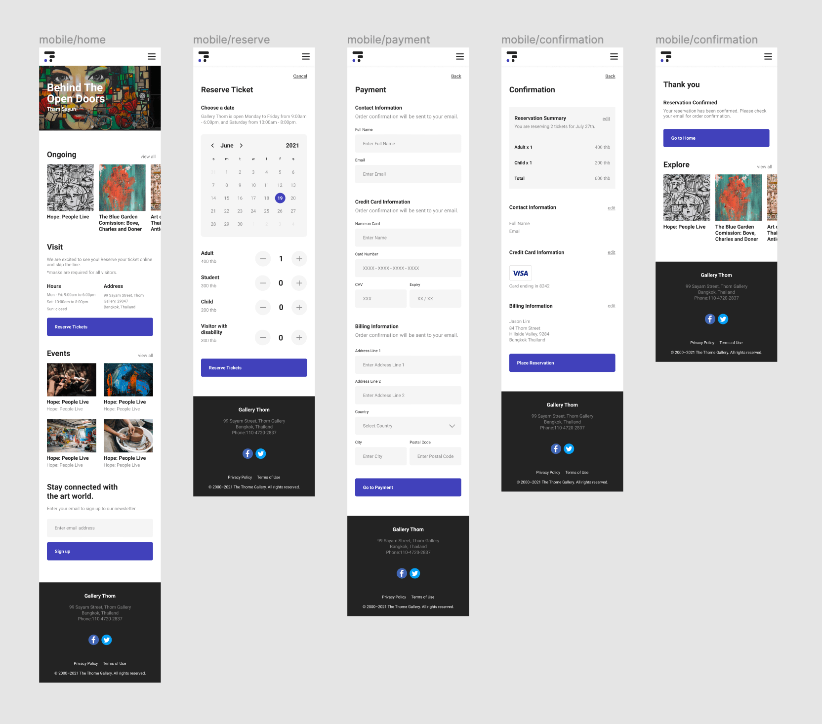
I decided to create a low-fidelity prototype early on in the design process to prevent potential major changes later on in the process that may cost me a lot of time and resources. The prototype was created within Figma.
Test
Conduct Usability Study
Before conducting the usability study, I laid out all the important parts of the study to make sure I had a clear goal.
Research Goal
Figure out what specific difficulties users encounter when they try to complete the core tasks(reservations) of the gallery website. Collect qualitative and quantitative data and determine participant’s overall satisfaction with the website.
Research Questions
What can we learn from the current user journey that we can improve on?
Are there any parts of the process users are getting stuck?
5 participants will complete predetermined tasks and fill out a questionnaire on their experience.
Each session will last 30 minutes and will include an introduction, a list of tasks, and a short questionnaire.
Participants will be asked to record the screen and think aloud.
Participants
Busy professionals that go to art galleries at least 1 time a month.
Age group from the following ranges: 20-30, 31-50, 50+
Script
I wrote up a script to guide the usability study to make sure each participant had all the necessary information about the study. The script included an introduction, a section on data use and consent, instructions on think aloud method, basic questions, tasks and a survey.
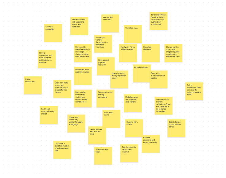
Synthesize Findings
Affinity Diagram
I took all the findings from the usability study to map out an affinity diagram. I grouped my findings into 7 groups: Edit/delete, Onboarding, Split Tasks, Emojis, Gestures, Daily Tips, and others.
Iterate Design
Iteration
I focused on recurring themes from the usability study to organize findings into insights to implement into the design iterations. There were two main issues that came up:
Ticket Reservation: Users had to sign up in order to reserve a ticket. Not every user wanted to create an account.
Calendar: Users could only reserve a ticket for the current month.
Iterate
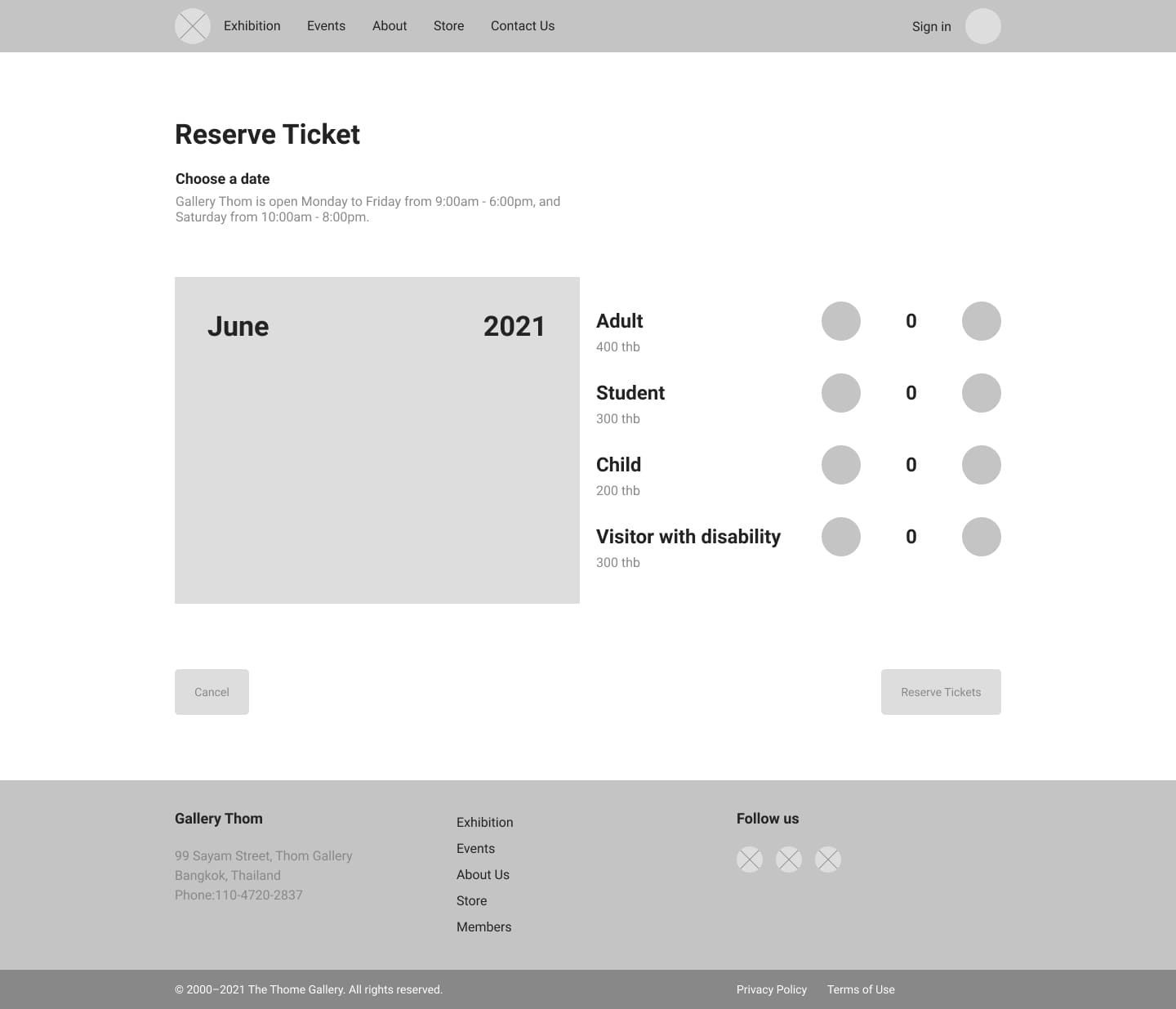
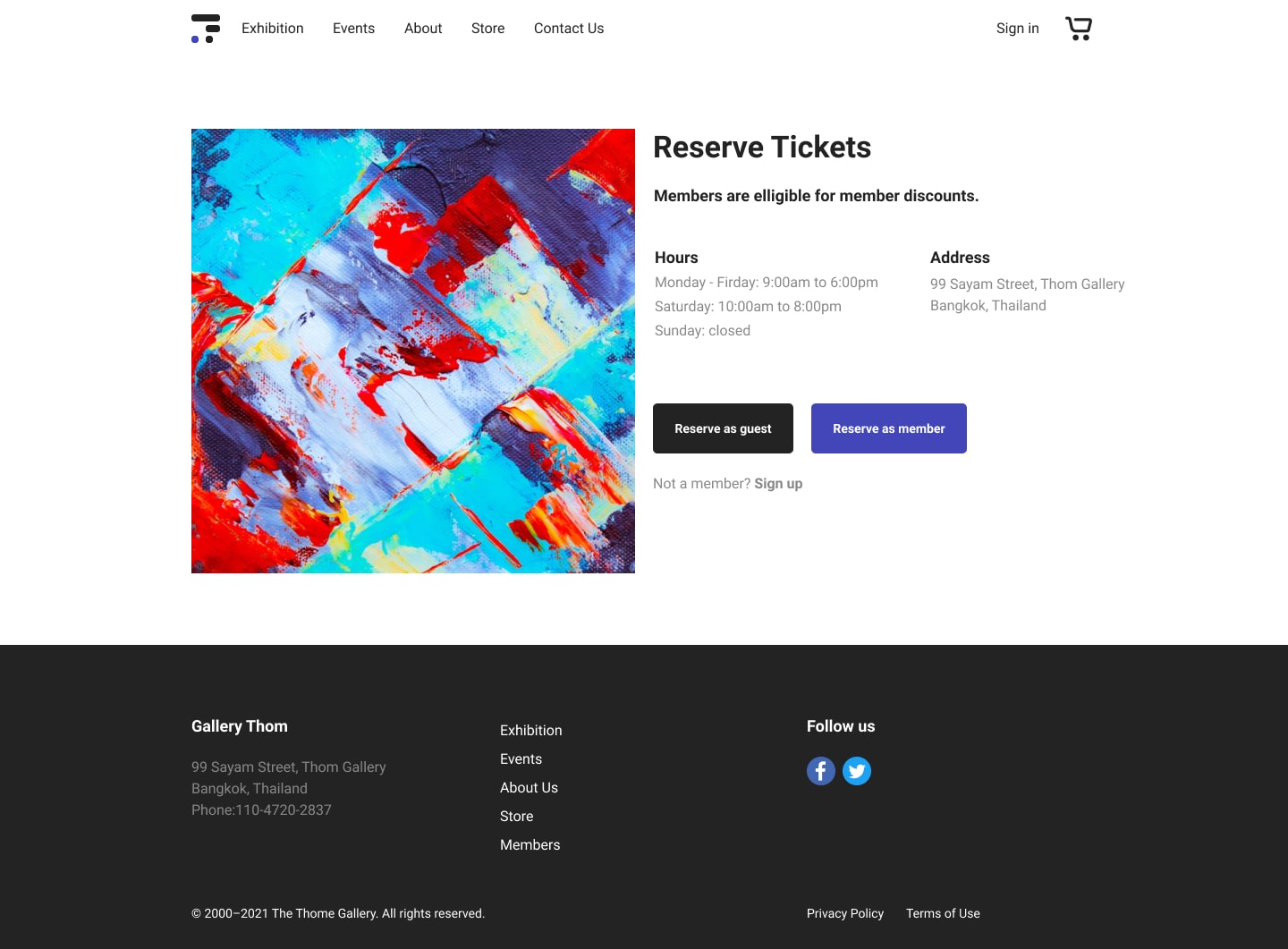
Ticket Reservation
Reserve as Guest
During the usability test, there was feedback that users wanted an easier way to delete tasks after task creation without having to click on each task and deleting it from the edit page.
Solution: An option to reserve the ticket as guest was added to the checkout user flow.
Before
After
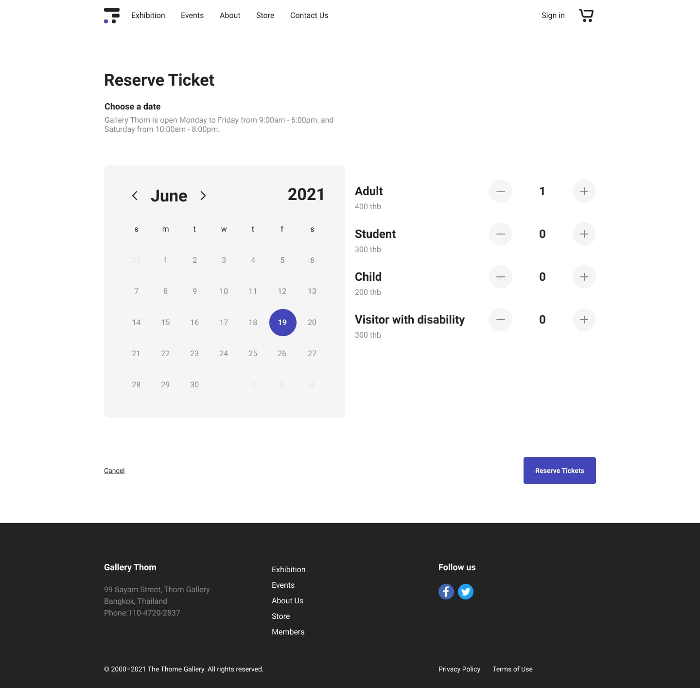
Calendar
Choose Month
In the early designs, the daily productivity tips stayed fixed on the top of the screen. After the usability study, it was clear that some users thought that it was taking up too much space and not all users wanted daily tips.
Solution: Arrows were added to the calendar so visitors can change the month for their reservation.
Before
After
Accessibility
Consider Accessibility
WCAG
Colors that comply with WCAG standards.
Labels
Clear labels, alt text, and descriptions for elements to accommodate screen readers.
Takeaway
Going Forward
Validate Design Solutions
Conduct another round of usability studies with the high fidelity prototype to validate whether the pain points users experienced before the design iterations have effectively been addressed.
Research Local Users
Much of the user research was conducted in Korea. For a more accurate representation of the target userbase, further research should be conducted in Thailand.
Let's Connect
I am always looking for new opportunities to find user problems and design data-driven solutions. Do you have a project in mind?