Mamo Pay is an app empowering people to effortlessly access their money through simpler, faster, friendlier finance.
Problem Brief
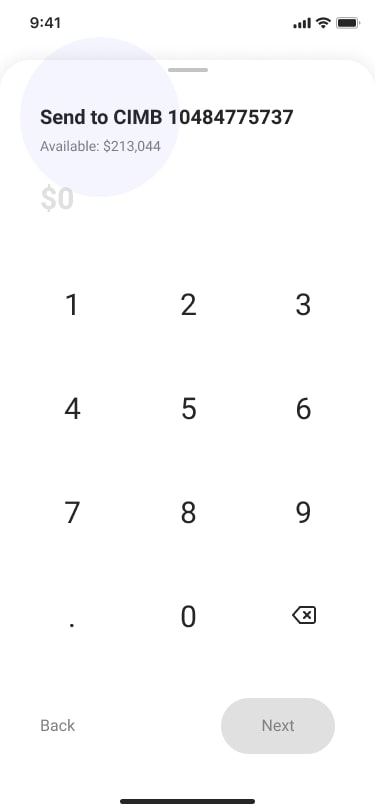
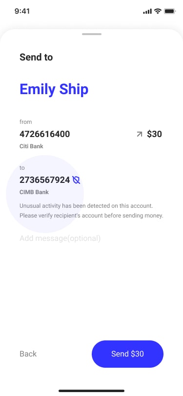
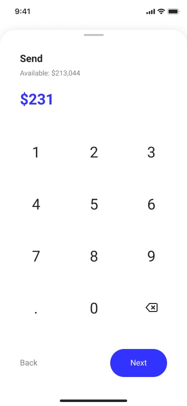
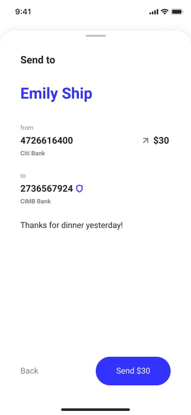
As a user, I want to send a friend money I owe, in the simplest and easiest way possible. I’d like to include a thank you message. I’d like a confirmation that this was successfully completed.
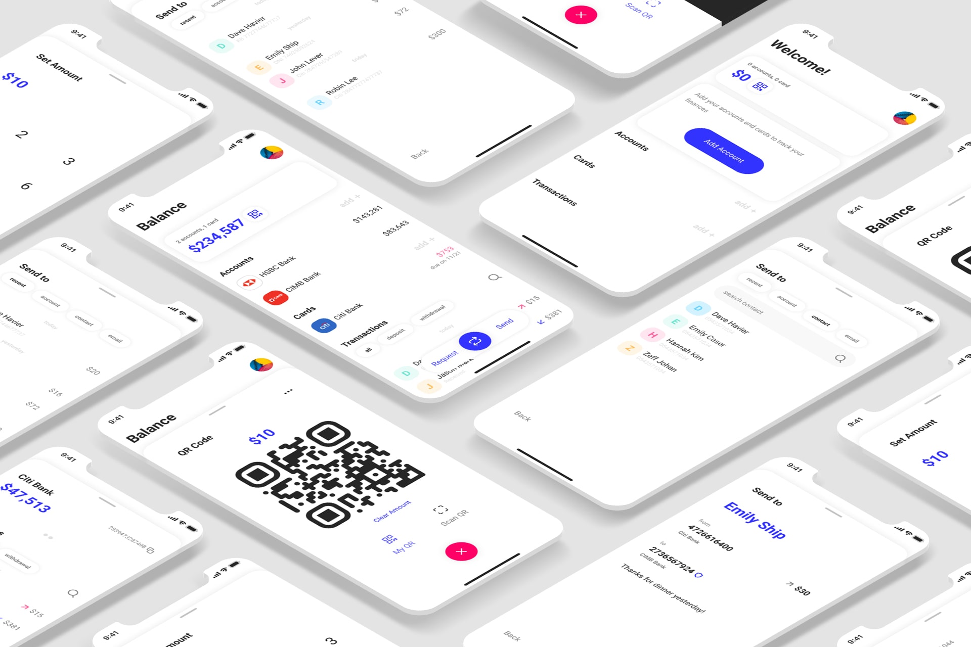
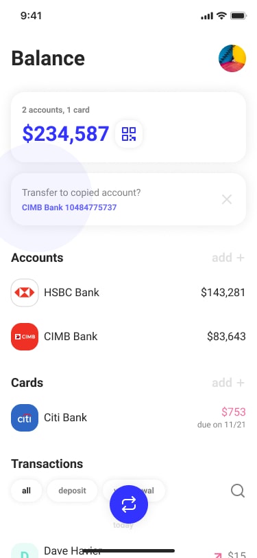
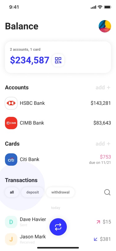
As a user, I wanted to see my balance on a screen that also shows me my recent activities and any additional features that may be helpful.
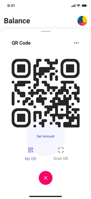
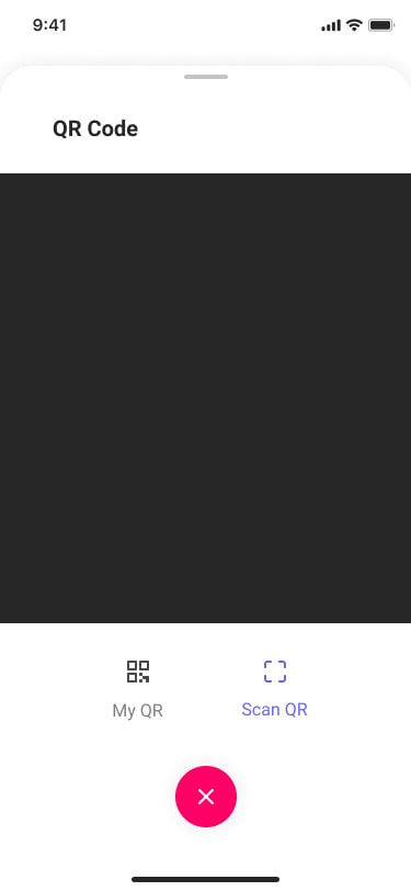
As a user, I want to share a QR code to my wallet with my friends and family, so they can quickly and easily pay me the money they owe.
Due to the time constraint of this project, I had to compress the design process. I started by looking at the resources shared by the Mamo team. This included user personas(Amira Maryam Nayeli, Walid Aboulnaga), style guides, and information regarding the Mamo experience. There was a lot of helpful information in the user personas, and I was able to find a few recurring themes that would guide the initial direction of the project.
Users struggle when splitting bills.
Users are frustrated by slow/complicated money transferring methods.
I also decided to conduct 3 short user interviews to further explore existing pain points. Participants were chosen based on the persona characteristics: male and female aged 30-40 working in the tech industry. The goal of the interview was to understand common challenges individuals faced when using payment apps and traditional banking services. I was able to come up with several pain points but decided to tackle just a few.
Insecurity to see if money was sent to the correct person.
Inability to search past transactions with keywords. Users instead had to select a time frame and check one by one.
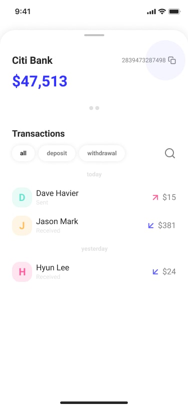
Inability to copy bank account numbers within the app. When users are inputting their account number online(ex. Shopify), they had to memorize their account number from the app.
Ideation
Some solutions to the problems from the research were pretty straight forward while some required a bit more thinking. I started off with a couple of “how might we” exercises to get ideas flowing.
How might we give the users more confidence in sending money with the Mamo Pay app?
How might we reduce the number of steps required for money transfers?
Potential solutions to the pain points included:
Copy account, email, phone number information from other apps to autofill within Mamo Pay.
Allow users to click on their account number to copy it.
Add keyword search functionality to transaction history.
Track account number and confirm account holder name before transfer.
Check recipient account’s fraudulent activity and notify users before completing a transfer.
Prioritization
I ran a quick survey asking 10 participants on the order of importance of main features from the problem brief to help me prioritize and start thinking about the appropriate layout. Although participants were chosen based on similar characteristics to those of the personas, the survey was conducted in Korea and results may differ from other demographics. (1 – most important, 3 – least important)
Check balance
Transfer money
Share QR code
In the prioritization phase, I also sorted through the potential solutions from the ideation phase to see which features were high impact for the users while keeping in mind the technical aspects of the feature implementation. Collaborating with engineers early on in the design process would be best to check on feasibility, but since I did not have direct access to the team for this project, I made my decisions based on my experience working with engineers in the past.
With a bunch of solutions/ features to work with, I was ready for the design phase. Due to the limited time, I skipped the wireframes and jumped straight into the high-fidelity designs.
Style Guide
Mamo Pay resources were referenced in creating a basic project style guide in Figma for this project.
When users copy account numbers, phone numbers, or emails from different apps, they will show up as a suggestion within Mamo Pay. This reduces the number of steps required in money transfers and gives the user confidence that money is being sent to the correct account.
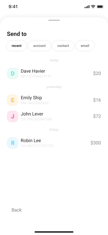
When users are not using the autofill feature, users can choose recipients based on recent, account, contact, or email.
Account Safety
Name & Fraud Check
When users send money using an account number, Mamo Pay sends an API request to the bank to check the account holder. Mamo Pay will show the account holder’s name in the confirmation step and if the name does not match the person the user is trying to send the money to, the user will know instantly that they have typed in the wrong account number.
Mamo Pay checks the recipient account with 3rd party/bank databases for fraudulent activity and warns the user to verify the recipient if anything unusual is found. These features increase user confidence in using the Mamo Pay app by preventing potential scams or mistakes before occurring.
Every country has different regulations and these features will require close collaboration with engineers and banks to check the feasibility. Bringing the engineering team and other stakeholders early on in the design process will help get rid of solutions that are not feasible and prioritize on which features to develop further in the design.
Recent Transactions
Track Finances
Users can easily track the recent transactions of all their accounts from the home page. To see individual bank account transactions, users can tap on the specific account to see the details. Filters and search functionality were added to help users quickly find transactions. Users can copy their account number by tapping on it.
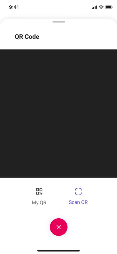
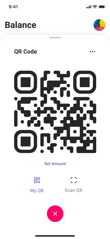
QR Code
Share or Scan
Users can easily share or scan a QR code when they want to split a bill. Users can set a specific amount to request before sharing the QR code (see above video).
Let's Connect
I am always looking for new opportunities to find user problems and design data-driven solutions. Do you have a project in mind?