Trieber is a comprehensive travel application helping users streamline travel planning and maximize travel experiences.
It curates tourist destination content providing the latest information on the most popular activities and attractions. Trieber offers reservation tools for hotels, transportation, restaurants and travel experiences.
Responsibilities
Conducting user interviews, paper and digital wireframing, low and high-fidelity prototyping, conducting usability studies, and iterating on designs.
Team
I collaborated with 1 engineer and 1 project manager to build Trieber. Communication was done through Google Hangouts and email. Most meetings were conducted online except for special cases where we met offline to discuss technical issues that were easier to explain face to face. We used Google Drive for file management and designer-developer handoff was done through Zeplin.
Category
iOS Application
Android Application
Duration
6 weeks
Tools
Sketch Zeplin
Login
Since users that see this screen will generally be first-time users, the signup was given priority over the login. The primary button is used for the signup and simple text is used for the login under the password box. “Already have an account? Login here.”
To further streamline the signup process, social logins were used. The order of the social login icons were based on the number of social login users.
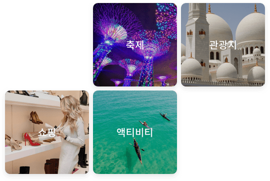
Destination
Destination content is hand-picked by Trieber recommending the most popular restaurants, hotels, and activities for each city.
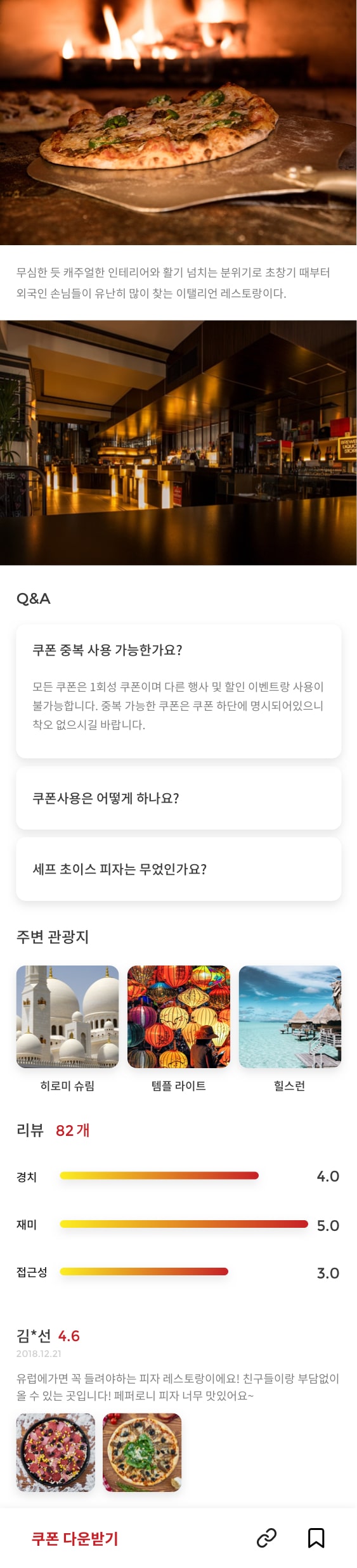
Store Detail
Users can find all the necessary information regarding businesses on one page.
Information is organized in the following order: business name, number review, general information(operation time, language, category, etc..), price(menu, tickets), location, story(in-depth review), q&a, nearby attractions, reviews.
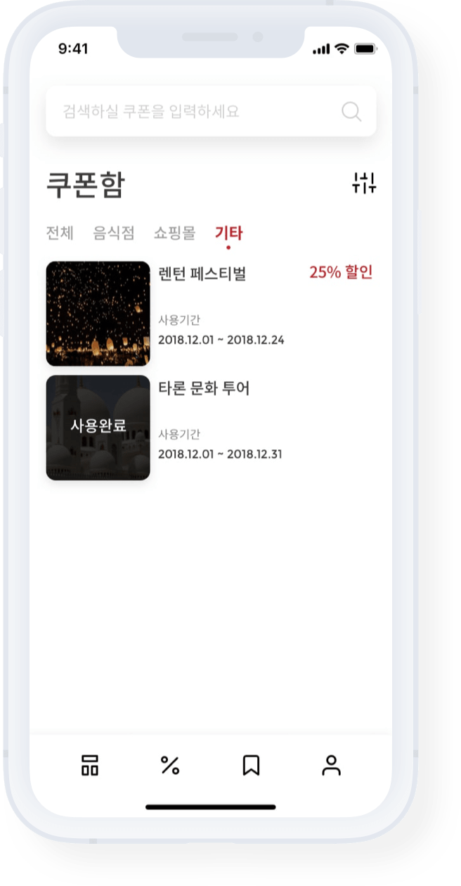
My Coupons
Downloaded coupons can be filtered by category for easy search.
The UI is kept simple by only displaying the most important information: business name, benefit, coupon expiration date.
#restaurants
#shopping
#hotels
Coupon Detail
Coupons are scanned by the business when used.
Trieber pulls up the appropriate membership card for earning points.
Bookmark
All hotels, restaurants, destinations, and activities on Trieber come with a promotion or coupon. Users can bookmark places for easy lookup.
The interface is designed to guide the user to download the coupon. The high contrast red text highlights the benefits and the red button uses an action verb to persuade users to take action.
Map
Maps is a great way to find authentic restaurants and exciting activities.
Users can search by keyword and see all the places with the associated keyword right on the map.
User Review
Hotels, restaurants and activities are hand-picked and curated by Trieber. This helps increase the overall satisfaction of the users.
Users can submit reviews only once they have made a purchase. This helps verify reviews and prevent fake reviews from misguiding other users.
+ Retrospective
Challenges
Clients often want to add everything to their applications. This often creates a bloated service with too much information.
What can be improved?
Focusing on the details. Long titles are truncated. With the “best”, “new” badges next to the titles, this becomes an even bigger problem.
Exploring more options to display long titles without truncating the text.
Lessons
Balancing the goals of the client and the needs of the user is crucial. Prioritizing information and convincing the client with research and data is always a better solution than trying to add everything that the client wants.
Let's Connect
I am always looking for new opportunities to find user problems and design data-driven solutions. Do you have a project in mind?